The Executive’s Guide to News Sources You Can Actually Trust
A single misleading headline cost one hedge fund manager $14 million last quarter. He acted on breaking news from a source he’d trusted for years without checking its position on a media bias chart. The outlet had drifted significantly toward sensationalism, and the “exclusive” turned out to be speculation dressed as fact. Smart money doesn’t make that mistake twice.
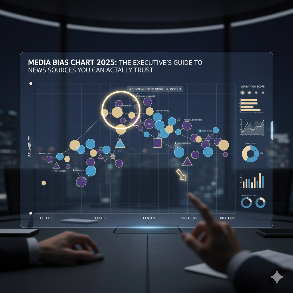
What Is a Media Bias Chart and Why Should You Care?
A media bias chart is a visual tool that maps news outlets along two axes. The horizontal axis measures political lean from left to right. The vertical axis measures reliability, ranging from original fact reporting at the top to fabricated information at the bottom. Think of it as a positioning map for the information economy.
The concept gained mainstream traction through Ad Fontes Media’s work, though several organizations now publish competing versions. Each uses slightly different methodologies, which matters when you’re making high-stakes decisions based on their ratings. According to Ad Fontes Media’s methodology documentation, their analysts evaluate individual articles and episodes across multiple criteria before assigning outlet-level scores.
For executives, investors, and anyone whose decisions ripple outward, media literacy isn’t optional anymore. A 2024 Edelman Trust Barometer report found that business leaders now rank media literacy among the top five skills for senior leadership. The information you consume shapes the decisions you make. Understanding where that information comes from—and what biases it carries—determines whether those decisions create or destroy value.
Most people glance at these charts and walk away with a simplistic takeaway: left sources bad, right sources good, or vice versa. That’s amateur hour. The vertical axis matters far more than the horizontal one for practical decision-making.
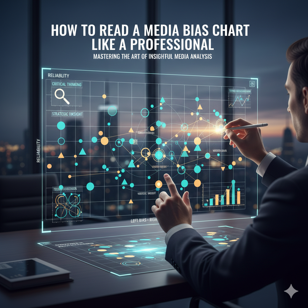
The Vertical Axis: Your Reliability Filter
The top tier contains outlets that primarily report original facts with minimal editorial spin. These sources invest heavily in verification, maintain clear separations between news and opinion, and issue corrections when wrong. Wire services like Reuters and AP typically occupy this space. They’re not exciting, but they’re rarely wrong on basic facts.
Moving down, you encounter analysis and opinion mixed with fact reporting. This middle zone includes most major newspapers and cable news. The information isn’t necessarily wrong, but it’s filtered through editorial perspectives. You’re getting interpretation alongside facts. For complex business decisions, this layer provides useful context once you’ve established the underlying facts elsewhere.
The bottom tiers contain outlets that prioritize engagement over accuracy. Sensational headlines, selective presentation of facts, and in the worst cases, fabricated content. These sources optimize for clicks and emotional response. They’re useful for understanding what narratives are circulating, but dangerous as primary information sources.
The Horizontal Axis: Political Lean in Context
Political lean matters less than most people assume, with one critical exception. When covering politically charged topics, outlets tend to emphasize facts that support their perspective while minimizing contradictory information. This doesn’t make them wrong—it makes them incomplete.
Sophisticated readers triangulate. They check how the same story appears across outlets at different points on the horizontal spectrum. Where the coverage converges, you’ve likely found solid ground. Where it diverges sharply, you’ve identified the contested territory that requires deeper investigation.
The Major Media Bias Charts Compared
Several organizations publish media bias charts, and they don’t always agree. Understanding their differences helps you use them more effectively.
Ad Fontes Media’s Interactive Media Bias Chart
Ad Fontes pioneered the modern media bias chart format. Their team of analysts from across the political spectrum rates individual articles and shows, then aggregates scores to the outlet level. They update ratings continuously and offer an interactive version that lets you explore methodology details for each source.
Strengths include transparent methodology, regular updates, and granular data at the article level. The limitation is that outlet-level scores can mask significant variation between a publication’s news desk and its opinion section.
AllSides Media Bias Ratings
AllSides takes a different approach, focusing primarily on political lean rather than reliability. They use a combination of editorial review, third-party analysis, and community feedback to assign ratings. Their media bias ratings page emphasizes helping readers identify blind spots in their news diet.
This methodology works well for understanding political positioning but provides less guidance on factual reliability. Use AllSides to diversify your information sources across the political spectrum, but pair it with other tools for accuracy assessment.
NewsGuard’s Credibility Ratings
NewsGuard employs journalists to evaluate news sites against nine criteria covering credibility and transparency. Rather than a visual chart, they provide numerical scores and detailed “nutrition labels” for each outlet. Their browser extension flags questionable sources in real-time as you browse.
This approach offers practical utility for daily news consumption. The tradeoff is less nuance on political positioning. NewsGuard focuses on whether outlets meet basic journalistic standards rather than mapping their ideological tendencies.
Building Your Personal Information Intelligence System
Charts are tools, not answers. The most effective approach combines chart awareness with deliberate consumption habits.
The Three-Source Verification Method
Before acting on any significant piece of information, verify it across three sources positioned differently on the media bias chart. Choose one from the center-left, one from the center-right, and one from the top tier of reliability regardless of lean. If all three confirm the core facts, you’re on solid ground. If they diverge, dig deeper before committing.
This method adds perhaps five minutes to your information gathering. For decisions involving substantial money, reputation, or relationships, that investment pays asymmetric returns.
Separating News Desks from Opinion Sections
Major publications operate distinct news and opinion divisions with different standards and objectives. The Wall Street Journal’s news reporting consistently rates as centrist and highly reliable. Its opinion pages lean significantly right. The New York Times shows the inverse pattern. Treating them as monolithic brands leads to poor information decisions.
When citing or acting on information, note whether it came from news reporting or opinion content. This distinction matters enormously for reliability assessment and for how others will perceive your information sources.
Recognizing Your Own Filter Bubble
Algorithm-driven news feeds create personalized echo chambers. You see more of what you’ve engaged with before, which typically means content that confirms existing beliefs. A Pew Research study found that social media users increasingly encounter news through algorithmic recommendation rather than deliberate selection.
Counteract this by intentionally including sources outside your natural consumption patterns. Subscribe to one outlet from the opposite side of your political preferences—not the fringe, but the reputable center-left or center-right you’d normally skip. The goal isn’t to change your views but to understand how informed people who disagree with you see the same events.
Media Bias in Specialized Coverage Areas
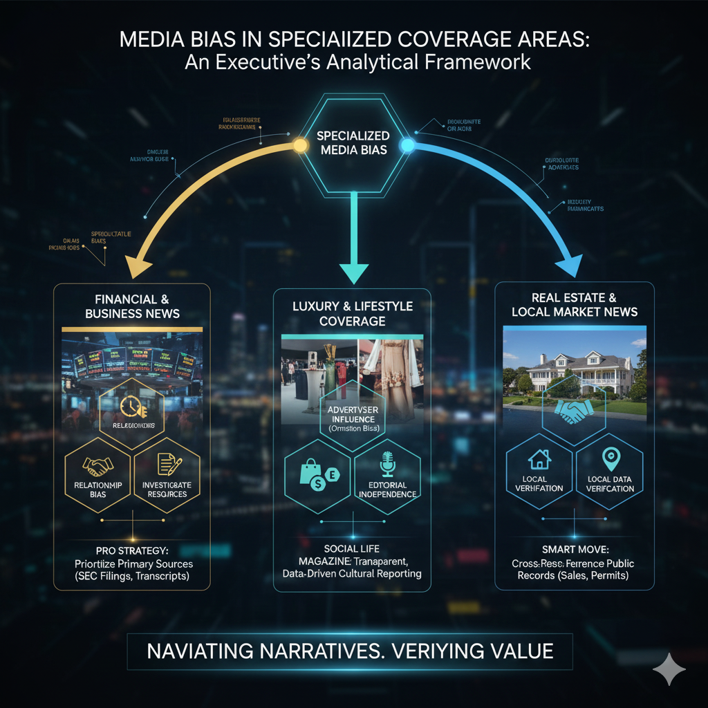
General media bias charts provide baseline guidance, but specialized coverage areas have their own dynamics.
Financial and Business News
Financial media faces unique pressures. Access to executives and deal flow depends on maintaining relationships, which can soften critical coverage. Meanwhile, the 24-hour news cycle demands constant content, pushing outlets toward speculation and hot takes. The most reliable financial journalism comes from outlets with deep investigative resources and editorial independence from advertising pressure.
For investment decisions, prioritize primary sources—SEC filings, earnings transcripts, official announcements—over media interpretation. Use financial media for context and analysis, but verify facts independently.
Luxury and Lifestyle Coverage
Lifestyle publications face different bias pressures. Advertiser relationships influence coverage selection, if not always coverage tone. A magazine dependent on luxury watch advertising may not publish critical coverage of the watch industry, even if such coverage would serve readers. This bias operates through omission rather than distortion.
At Social Life Magazine, we navigate this tension through editorial independence from advertising decisions and transparent disclosure of relationships. Our Hamptons event coverage and cultural reporting maintain consistent standards regardless of advertiser involvement.
Real Estate and Local Market News
Local news has hollowed out nationwide, leaving many markets without independent coverage. Real estate reporting often comes from industry-adjacent sources with inherent conflicts of interest. Verify market claims against public data—actual sales records, permit filings, demographic statistics—rather than relying on broker-sourced trend pieces.
For Hamptons-specific intelligence, our real estate coverage combines market data with on-the-ground reporting from writers who actually live and work in the community.
The Future of Media Bias Assessment
Artificial intelligence is transforming both media production and media assessment. AI tools can now analyze articles for bias markers at scale, potentially offering real-time ratings as you read. Simultaneously, AI-generated content is flooding information channels, making source verification more critical than ever.
The coming years will likely see media bias charts evolve from static ratings to dynamic, personalized tools. Imagine a system that learns your information needs and automatically flags when you’re operating in a filter bubble or relying too heavily on a single perspective. The underlying skill—critical evaluation of information sources—will only become more valuable.
Putting Media Bias Charts to Work
Understanding a media bias chart transforms how you consume information. Instead of passive reception, you become an active curator of your own intelligence system. You recognize when sources are giving you interpretation versus facts. You notice when coverage converges or diverges across the spectrum. You make decisions based on verified information rather than algorithmic feeds.
Start by bookmarking one reliable media bias chart and checking it whenever you encounter an unfamiliar source. Build the habit of triangulating significant claims across multiple outlets. Deliberately include perspectives outside your comfort zone. These small practices compound into a substantial advantage in any field where information quality matters.
The hedge fund manager from our opening learned his lesson expensively. You can learn it for free. The media bias chart is your map. Use it well, and you’ll navigate information markets the way sophisticated players navigate financial ones—with eyes open and risks managed.
For readers who value independent, intelligent coverage of the people and trends shaping luxury markets, subscribe to Social Life Magazine’s print edition. Join the conversation with decision-makers who understand that what you read shapes what you become.
Related Reading:
Author

Written by
Recent Posts
Why Choose Open Source LMS for Custom Learning
How Pop Culture Collectibles Are Shaping the Way Fans Connect
Why aging well should include serious eye care
Komodo Island Trip from Lombok: The Ultimate Adventure Guide
How to keep your home’s exterior looking great all summer long
Categories
- Art
- Articles
- Business of Luxury
- Celebrities
- Entertainment
- Events
- Fashion
- Fashion & Style
- Featured
- Finance
- Food, Spirits, Wine
- Hamptons
- Hamptons Celebrities
- Hamptons Lifestyle
- Health
- Health & Beauty
- Lifestyle
- Luxury Lifestyle
- Press
- Profiles
- Real Estate
- Social Scene
- Technology
- The Chronicles
- Travel
- Uncategorized
- Weddings