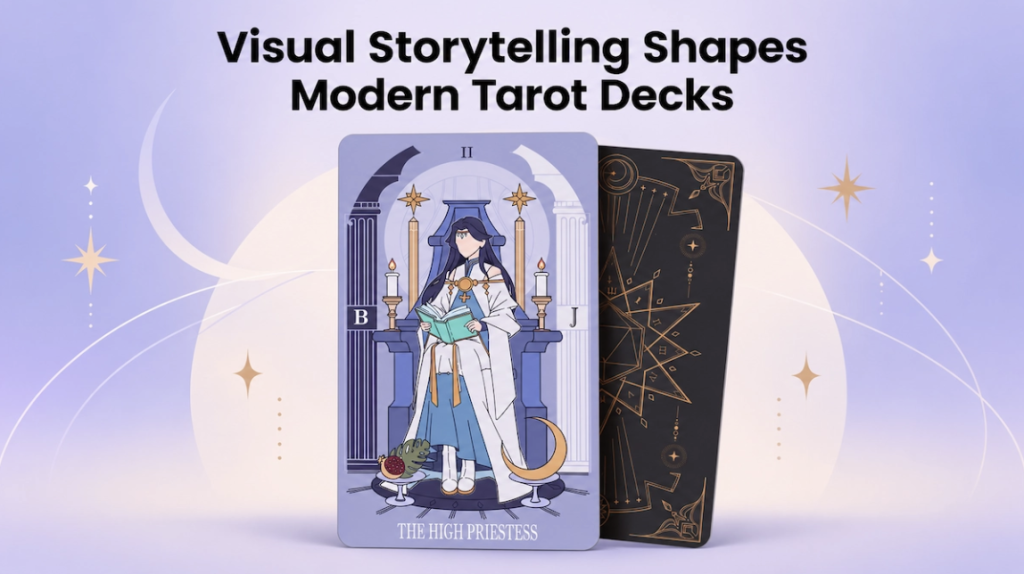
Tarot has always depended on images. Long before a reader interprets a card through a guidebook, the artwork already begins telling a story through characters, objects, colors, gestures, and composition.
Modern tarot artists are pushing that visual language further. Some decks reinterpret familiar archetypes through fantasy, folklore, nature, or contemporary life, while others build entirely new visual worlds. What connects the strongest designs is not simply beautiful illustration, but visual storytelling that works across an entire deck.
For creators developing their own tarot cards, understanding how those visual choices communicate meaning can make the difference between a collection of attractive images and a deck that feels coherent.
Tarot Cards Work as a Visual Language
A tarot card rarely communicates through one symbol alone. Meaning often comes from the relationship between several visual elements.
A figure looking toward the horizon creates a different feeling from one looking directly at the viewer. An open doorway suggests something different from a locked one. Even the amount of empty space around a character can change how a card feels.
This makes tarot illustration closer to sequential storytelling than isolated artwork. Each card needs to work independently while still belonging to the same visual system.
When planning a deck, creators should think beyond individual compositions and ask how the cards will speak to one another when placed side by side.
Symbols Give the Artwork Layers
Symbolism remains one of the most recognizable parts of tarot design, but modern decks do not have to copy traditional imagery exactly.
Traditional Symbols Can Be Reinterpreted
Classic tarot imagery often includes recurring elements such as celestial objects, animals, plants, architecture, water, fire, crowns, tools, and paths. Artists can preserve the underlying idea while changing how those elements appear.
A traditional landscape might become a futuristic city. A sword may be replaced by another object that communicates conflict, clarity, or decision-making within the deck’s world.
The key is consistency. If a particular symbol represents an idea in one card, repeating or developing it elsewhere can strengthen the deck’s visual vocabulary.
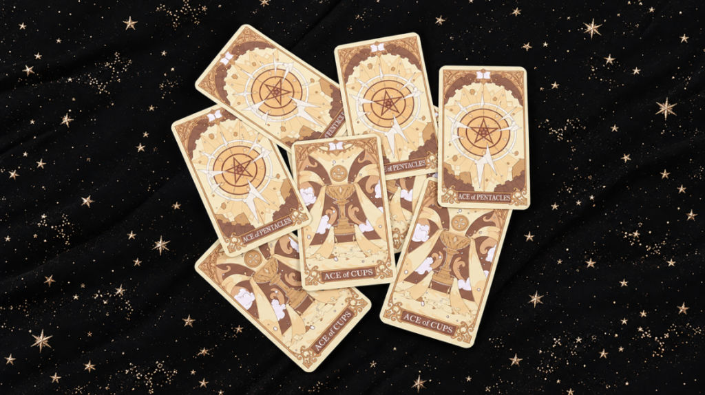
Color Can Carry Meaning Across the Deck
Color is another storytelling tool that works before the viewer consciously interprets the image.
Warm colors can make certain scenes feel energetic or intense, while cooler palettes may create distance, calm, mystery, or reflection. High contrast can draw attention to a central figure, while muted tones can give a deck a softer atmosphere.
Creators do not need to assign a strict meaning to every color. What matters more is creating rules that feel consistent.
For example, gold accents might repeatedly appear around moments of insight, while a particular blue could connect cards involving intuition or introspection. These subtle repetitions help viewers recognize relationships throughout the deck.
Build a Visual System, Not 78 Separate Illustrations
One of the biggest challenges in tarot deck design is maintaining consistency over a large body of artwork.
Characters, framing, typography, borders, numbering, icon placement, and card backs should feel connected even when individual scenes differ dramatically.
Before illustrating the entire deck, it helps to establish a small design system covering:
- overall illustration style
- recurring symbols and motifs
- core color palette
- border and frame treatment
- typography
- card titles and numbering
- visual hierarchy
Creating several representative cards first can reveal whether these decisions work together.
Once the visual direction is established, creators planning physical production can explore formats such as custom tarot cards to understand how artwork, printing, and decorative finishes may translate from a digital concept into a finished deck.
Composition Guides the Reader’s Eye
Good tarot artwork does not need to explain everything immediately.
Composition can deliberately guide attention from one element to another. A character may be the first focal point, followed by an object in their hand and then a symbol in the background. That sequence creates a small visual narrative within a single card.
Direction also matters. Figures facing inward toward the center of a spread can feel different from those facing away. Vertical movement may suggest growth or aspiration, while downward movement can create a feeling of weight, grounding, or descent.
These choices are especially important when artwork contains many symbolic elements. Without clear hierarchy, meaningful details can become visual clutter.
Card Size Changes How a Story Is Seen
Artwork that looks impressive on a large digital canvas may behave very differently when printed.
Fine lines, small symbols, decorative borders, and text all compete for limited space. This means tarot card size is not just a production decision—it directly affects visual storytelling.
A larger format gives complex illustrations more room to breathe, while a compact deck may require stronger silhouettes and fewer small details. Creators deciding between formats can use a tarot card size guide to compare common dimensions and consider how handling, artwork detail, and readability interact.
Printing a few designs at actual size before finishing the entire deck is also useful. Details that look obvious at 200% zoom can become surprisingly subtle in the hand.
Modern Decks Can Tell New Stories
Modern tarot artwork increasingly reflects the individual worlds of its creators.
A deck may draw from mythology, botanical illustration, gothic art, science fiction, everyday city life, or an artist’s original characters. These approaches can feel very different from traditional tarot imagery while still using visual storytelling to connect ideas across the cards.
The strongest reinterpretations usually have a clear reason behind their visual choices. Changing an established symbol simply to make a card look different can weaken meaning. Reimagining it in a way that supports the deck’s larger theme can make the concept feel much more intentional.
A Tarot Deck Is More Than a Collection of Images
Beautiful individual cards can attract attention, but a memorable tarot deck usually succeeds because the artwork works together.
Symbols repeat and evolve. Colors create relationships. Composition directs attention. Characters, environments, typography, and even physical dimensions contribute to the experience of moving through the deck.
For creators, that means the design process is not only about illustrating one card after another. It is about building a visual language that remains recognizable from the first card to the last.
When every visual choice contributes to that shared language, a tarot deck becomes more than a set of illustrations—it becomes a world the reader can explore.
Author
Written by
Recent Posts
What an Auto Accident Lawyer Can Recover After a Serious Wreck
What Ginger and Turmeric Shots Do for Your Body When Taken Daily
What Should You Know About Getting a Cold Sore Prescription Online?
Porch Enclosures That Let Outdoor Living Last Longer
What Your E1 Visa Lawyer Verifies in Substantial Trade Records
Categories
- Art
- Articles
- Business of Luxury
- Celebrities
- Culture
- Entertainment
- Events
- Faces of Summer 2026
- Fashion
- Fashion & Style
- Featured
- Finance
- Food, Spirits, Wine
- Hamptons
- Hamptons Celebrities
- Health
- Health & Beauty
- Lifestyle
- Luxury Lifestyle
- Press
- Profiles
- Real Estate
- Technology
- The Chronicles
- Travel
- Uncategorized
- Weddings