Think about the last restaurant that stayed with you. Not the dish — the room. The specific quality of light when you walked in. Whether the space made you want to settle in or sit up straighter. The way the noise level felt, not too quiet, not too loud, just right for the kind of conversation you were about to have.
The best restaurants engineer all of that deliberately. Every detail is a decision. And guests absorb those decisions in the first sixty seconds, long before anyone has handed them a menu.
The Room Tells You What Kind of Evening This Is
There’s a reason certain Hamptons and Manhattan dining rooms carry a particular charge. You feel it before you’ve been seated. The space has communicated something — intimate, theatrical, celebratory, serious — through design alone.
This is not accidental. It’s the result of lighting choices, material selections, the distance between tables, the placement of the bar, the proportions of the entry. None of these elements work in isolation. Together, they produce an atmosphere that guests register as a feeling: this place knows what it’s doing.
The operators who understand this treat the room as the first act of hospitality. Not the backdrop for it — the thing itself.
Arrival Is a Scene, Not a Transition
Most guests don’t walk straight to a table. They experience an arrival sequence: the entrance, the moment of reception, the walk through the dining room. In forgettable restaurants, this sequence is dead space. In memorable ones, it’s choreographed.
Some of the most celebrated rooms in the country compress and release. A narrow vestibule that gives way to an unexpectedly generous interior. The slight pause at a host stand positioned to offer a view across the room before you commit to it. A canopy or a threshold that separates the energy of the street from whatever is happening inside.
These transitions set expectations. A guest who arrives through a considered sequence is already in a different mental state from one who walked straight off the sidewalk into a table by the door.
Light Is the Room’s Most Powerful Tool
Ask any serious hospitality designer where restaurants go wrong and the answer is almost always the same. Not the furniture, not the materials. The light.
Specifically: uniform light. The mistake of treating a ceiling like a grid to be evenly covered rather than a surface to be used selectively. Flat, even illumination at a consistent level throughout a dining room produces exactly the atmosphere you’d expect — institutional, unvarying, entirely without mood.
What works is contrast. Warm ambient light low in the room, candles or votives on the table, pendant fixtures that add visual interest at eye level without competing with what’s below them. The bar lit to attract attention. The booths along the wall allowed to settle into something quieter. A few points of brightness, a lot of deliberate shadow.
The rooms that feel right are the rooms where someone made choices about what to illuminate and what to leave alone.
Materials Register Before Guests Know They’re Registering Them
Nobody sits down and consciously inventories the finish on the bar top. But they absorb it. The weight of a brass fixture, the texture of a leather banquette, the visual permanence of a stone floor — these accumulate into a judgment about the quality of the place that forms faster than thought.
The restraint that distinguishes serious restaurant interiors is real. One metal tone, held throughout. A seating palette that reads as considered rather than assembled. Marble where it earns its place, not as surface decoration everywhere. Velvet in a room that benefits from its acoustic properties, not just its look.
The rooms that feel expensive without announcing it are the rooms where the material choices are few and followed through. The ones that feel expensive and exhausting are the rooms where every surface is making its own case.
The Bar Sets the Room’s Energy
Every great restaurant room has a center of gravity. In almost every case, it’s the bar.
Not because of what’s served there. Because of what a well-positioned bar does to the spatial experience of the entire room. It gives arriving guests an immediate focal point. It generates visible activity — movement, light off glass, the theater of preparation — that elevates the atmosphere even at tables nowhere near it. And it creates a natural social division: the guests who came for the energy of the bar, and the guests who came for the quieter table. A well-planned floor plan accommodates both.
Bars that become signature features share a quality of inevitability. They feel like they could only be in that spot, at that height, at that scale. When a bar feels like it was sized to fill leftover space, the whole room feels provisional.
Spacing Is Luxury’s Most Legible Signal
The distance between tables is one of the clearest things a restaurant communicates about what it thinks of its guests. Rooms with tight seating — where you can hear the adjacent table without effort — are rooms that have prioritized covers over experience. Guests sense that trade-off immediately.
Banquettes do significant work in fine dining rooms for exactly this reason. They create physical containment around each table without requiring the sterile buffer of empty floor space. They define zones. They give guests a choice of orientation. And they’re acoustically useful — upholstered surfaces absorb sound in ways that hard chairs and bare floors do not.
Acoustics overall are underinvested in most restaurant design. The hum of a room where the sound level has been properly addressed — lively but not effortful — is one of the reliable markers of a room that was designed by someone who thought about what it would actually feel like to have dinner there.
Testing the Room Before It Gets Built
The decisions that determine a restaurant’s spatial identity are made months or years before opening. They’re made in conversations over drawings and material samples, trying to project how a sequence of choices will land in an actual room.
Before committing to millwork, banquettes, lighting positions, and bar placement, a restaurant 3D rendering lets an operator test whether the concept reads as intimate or theatrical, whether the bar dominates as intended, whether the finish palette coheres under the planned lighting conditions. For teams working through hospitality interiors at a larger scale, 3D commercial renders make it easier to compare spatial options and material combinations before construction makes revision expensive.
The gap between the room you imagined and the room that gets built is where good hospitality concepts quietly fail. Serious operators close that gap before anyone breaks ground.
Coherence Is the Thing That Lasts
Guests describe the restaurants they return to in sensory terms — the light, the feel of the room, the sense that every corner was thought about. What they’re responding to, usually without articulating it, is coherence.
A room where the lighting language matches the material palette, the acoustics match the seating density, the bar’s character matches the concept’s tone, the entry sequence matches the room’s ambitions — that room feels inevitable. Authoritative. Worth coming back to.
Expensive doesn’t get you there. Neither does visual impact alone. What gets you there is a consistent vision, held from the first design conversation to the last contractor decision, about the kind of evening you’re asking your guests to have.
The dinner is the occasion. The room is what makes it feel like one.
Author

Written by
Recent Posts
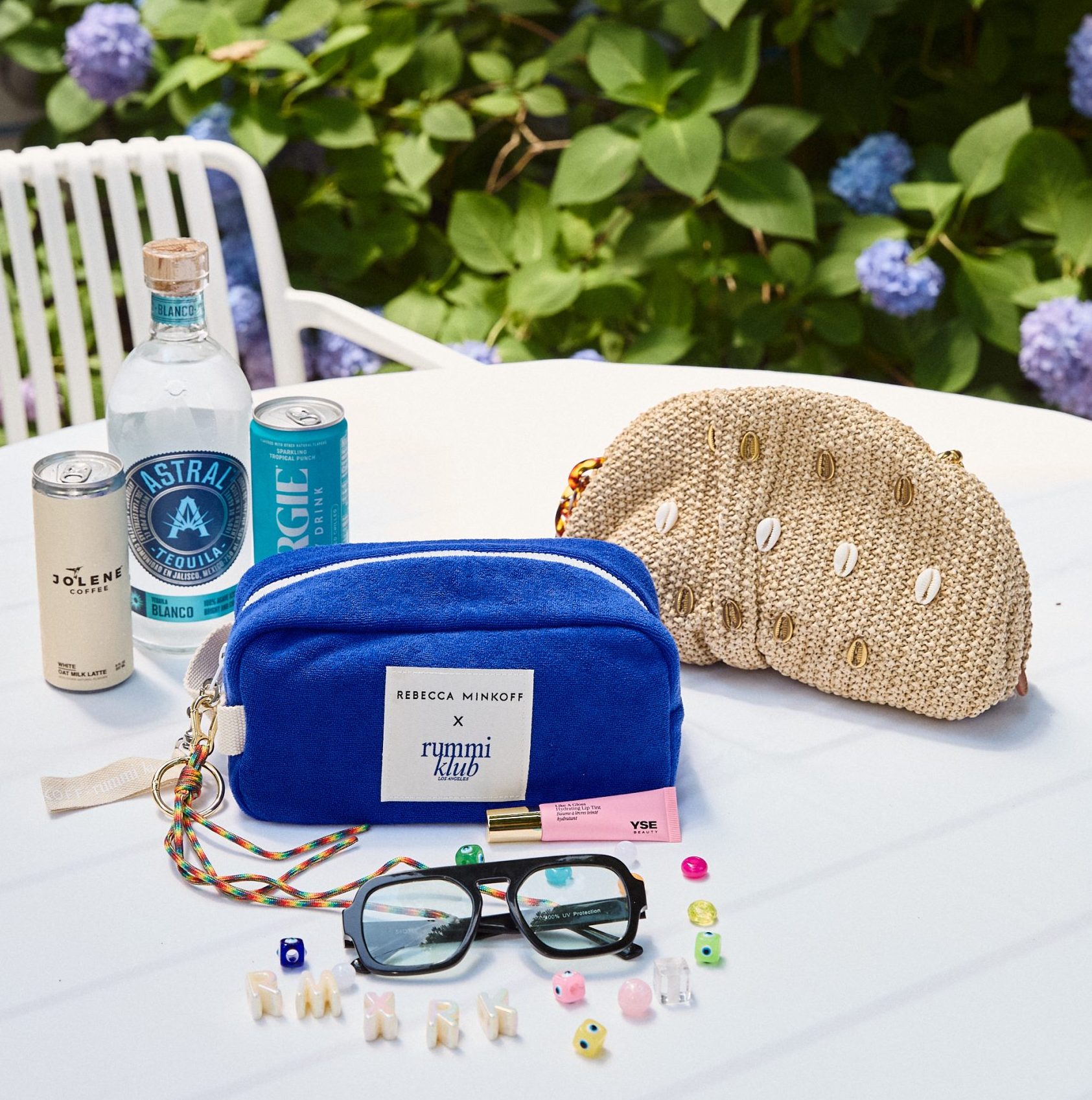
Rebecca Minkoff and RummiKlubLA Celebrate Their First-Ever Collaboration at The Maidstone Hote
5 Apps That Make Your Beauty Routine Smarter

Strategic Edge Why Precision and Speed in Modern Fabrication are Non Negotiable for Top Performance
9 Interior Design Details That Make a Home Feel More Thoughtful
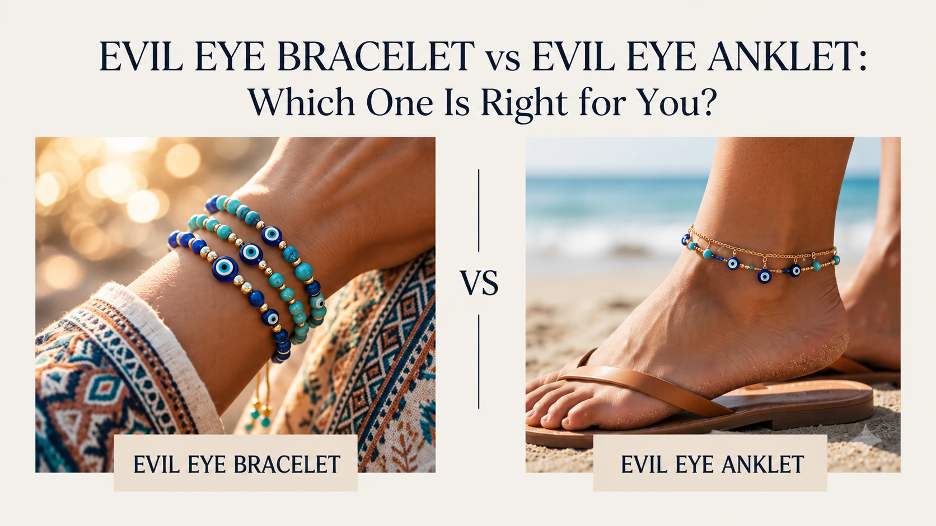
Evil Eye Bracelet vs Evil Eye Anklet: Which One Is Right for You?
Categories
- Art
- Articles
- Business of Luxury
- Celebrities
- Entertainment
- Events
- Faces of Summer 2026
- Fashion
- Fashion & Style
- Featured
- Finance
- Food, Spirits, Wine
- Hamptons
- Hamptons Celebrities
- Health
- Health & Beauty
- Lifestyle
- Luxury Lifestyle
- Press
- Profiles
- Real Estate
- Technology
- The Chronicles
- Travel
- Uncategorized
- Weddings